Web Design: My Hand Coded Portfolio
The process of creating this online portfolio using basic HTML and CSS.

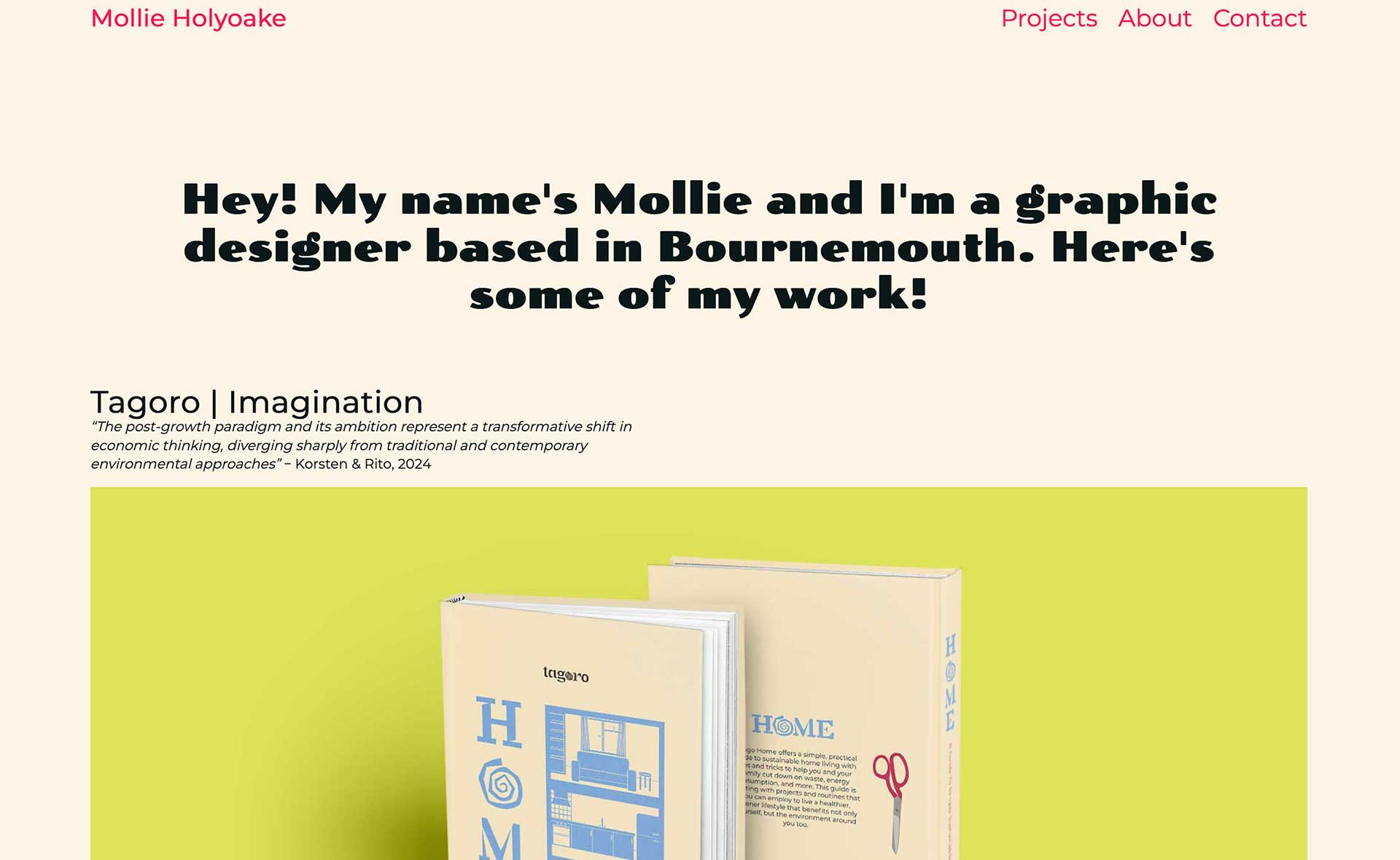
Narrative, Sequence, Interaction | Web Portfolio
As part of our second unit of second year, we have been tasked to hand code a website using HTML and CSS. To me, this was entirely new, and I have learned a lot in the process of building this portfolio. To prepare for this project, I did the Free Code Camp course that Mark Osborne showed us, which gave me a basic general understanding of HTML and CSS before we began building our websites.
Planning Process
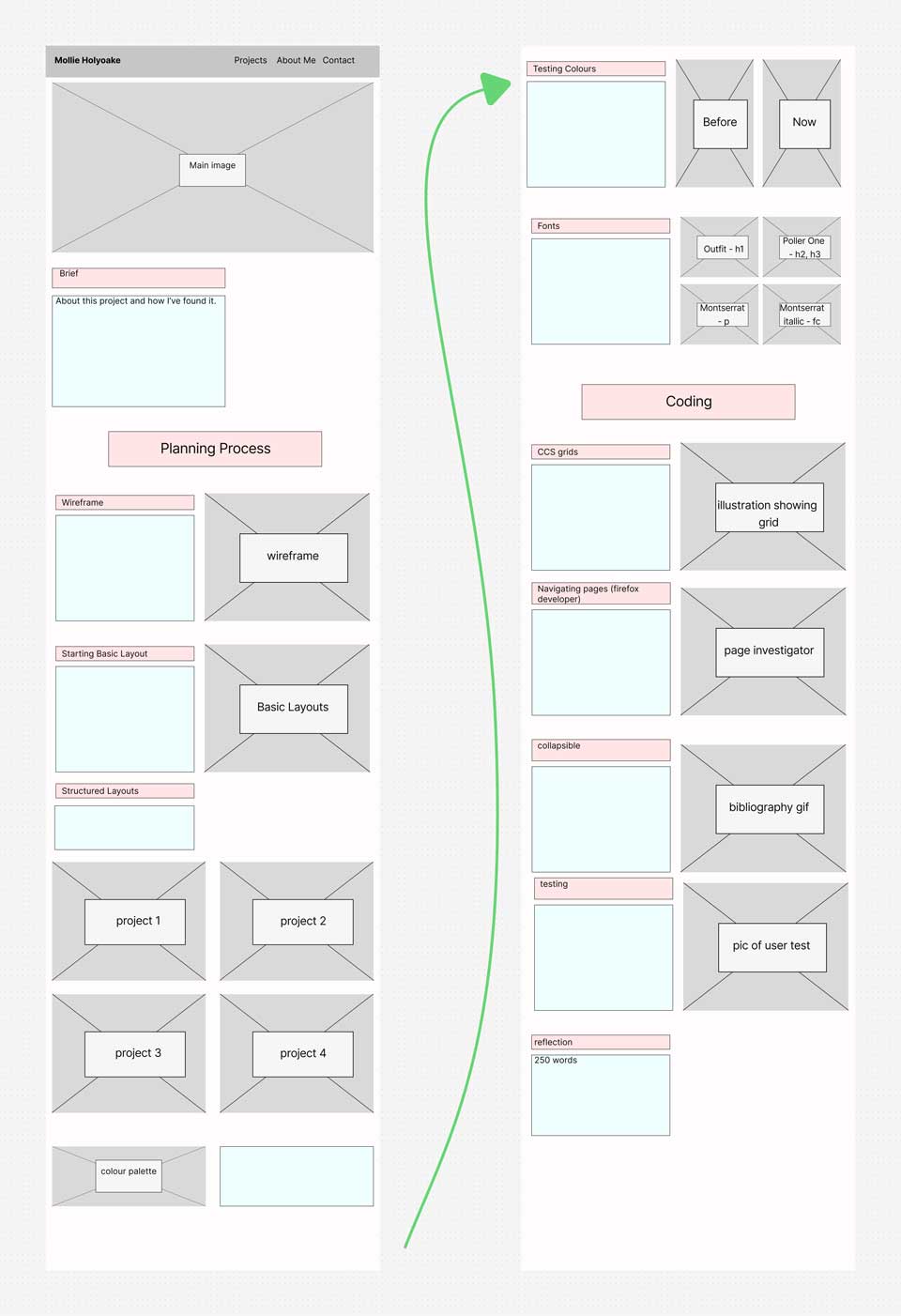
Wireframe
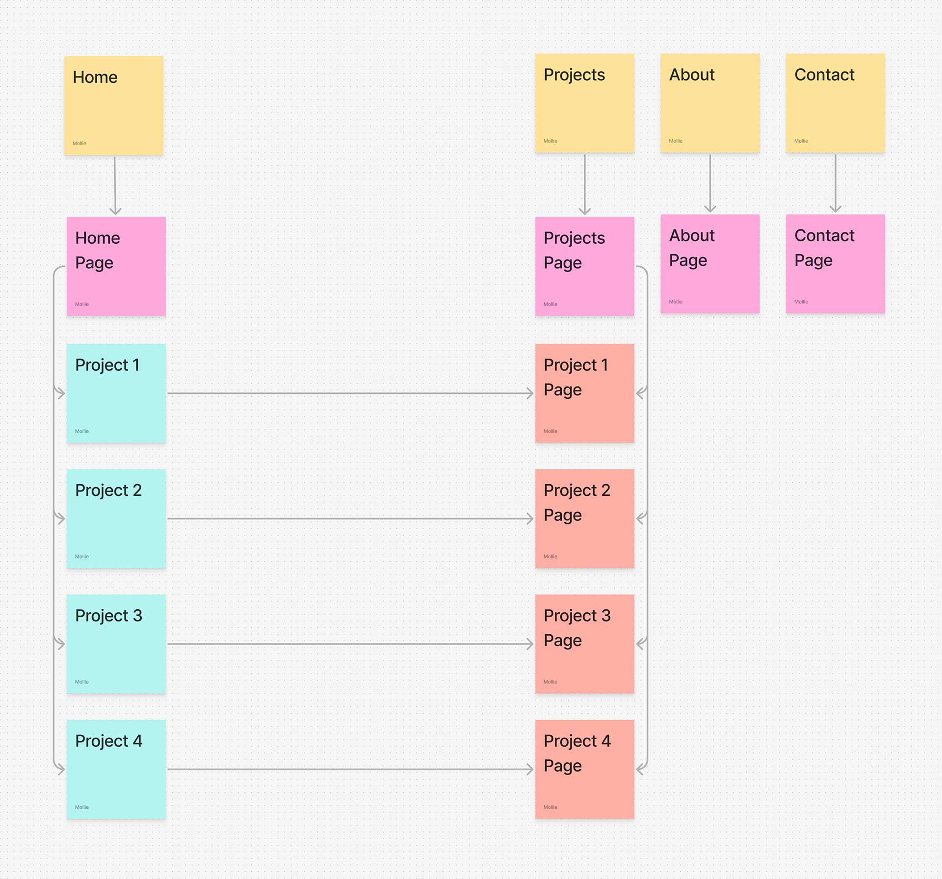
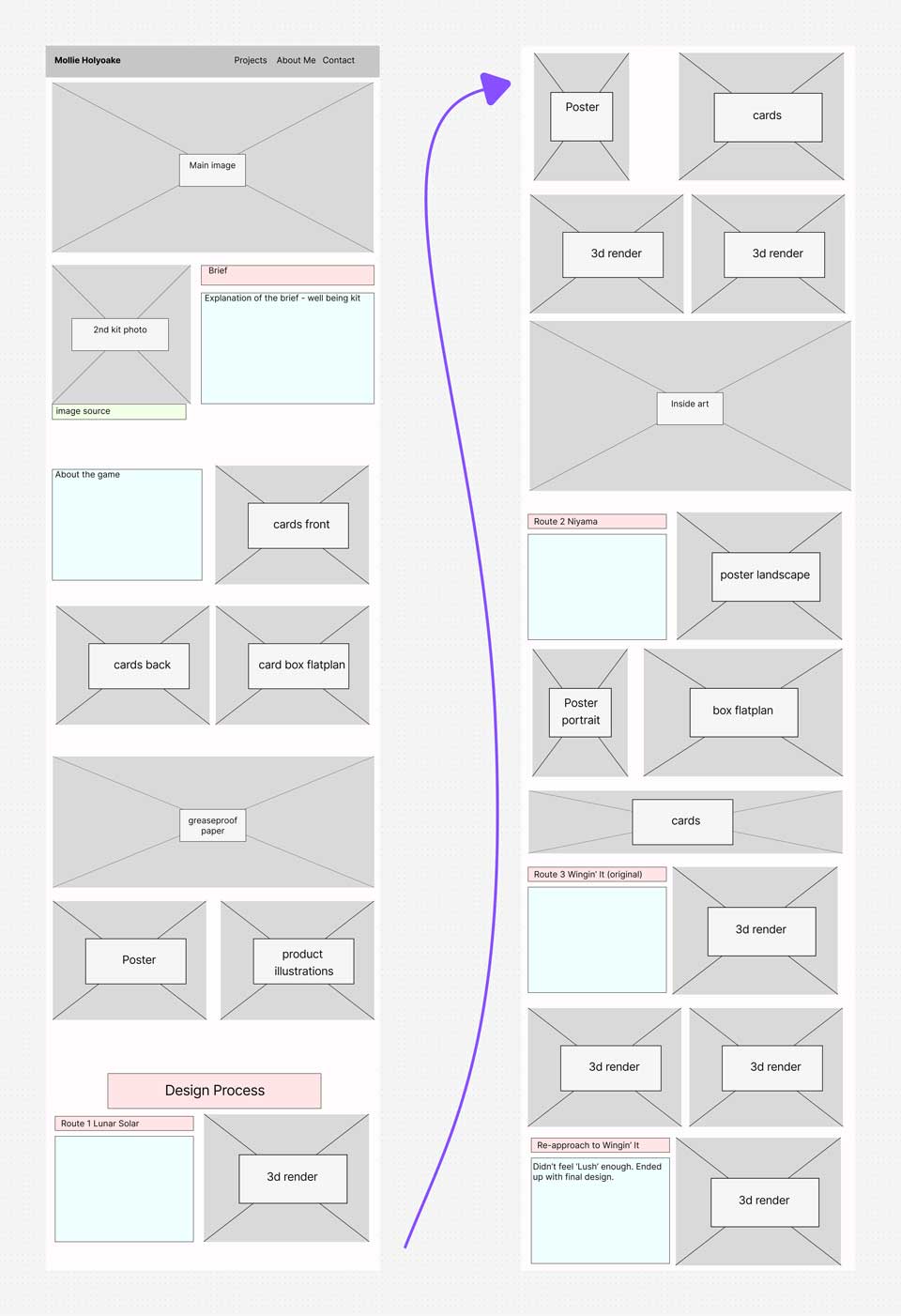
The wireframe for my website is very simple. This is the diagram I made at the start of this project to outline the general navigation of the site, using arrows to show which pages give access to others. Now towards the end stage of this project, I have since added a few more elements, such as ‘Other Work’ at the bottom of the project pages for a smoother user experience; however, I wanted to make sure that the website’s overall navigation remained simple and easy to explore.
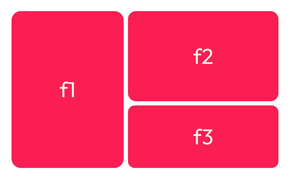
Basic Visual Layout — Page Hierarchy
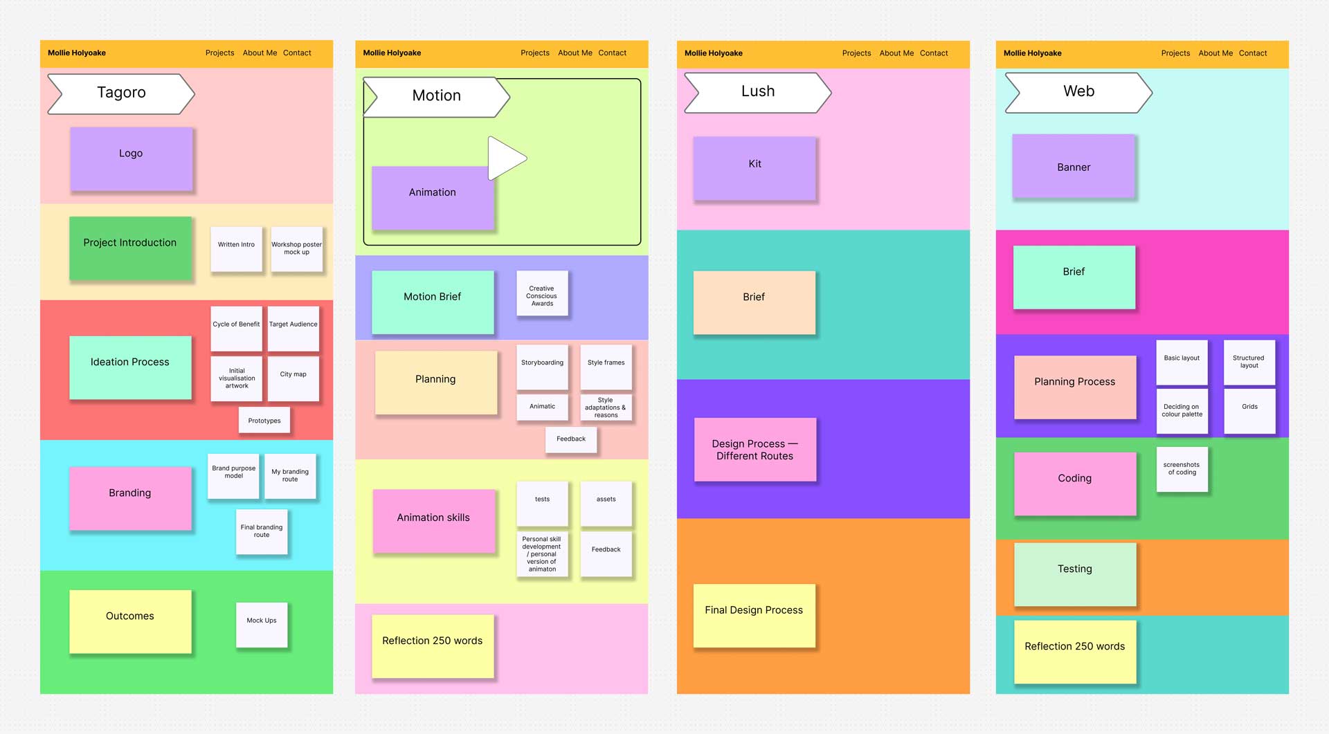
I wanted to have a clear understanding of what the hierarchy of each page would look like before I started to plan out the structure more precisely. I used different coloured blocks to outline the different sections of my projects pages, making sure that the elements that I felt were most important (my outcomes) were at the top. This means that anyone looking through my portfolio will see the final results of my work first and can then decide if they want to scroll down to take a look at my process and the various different stages of design that each project went through.
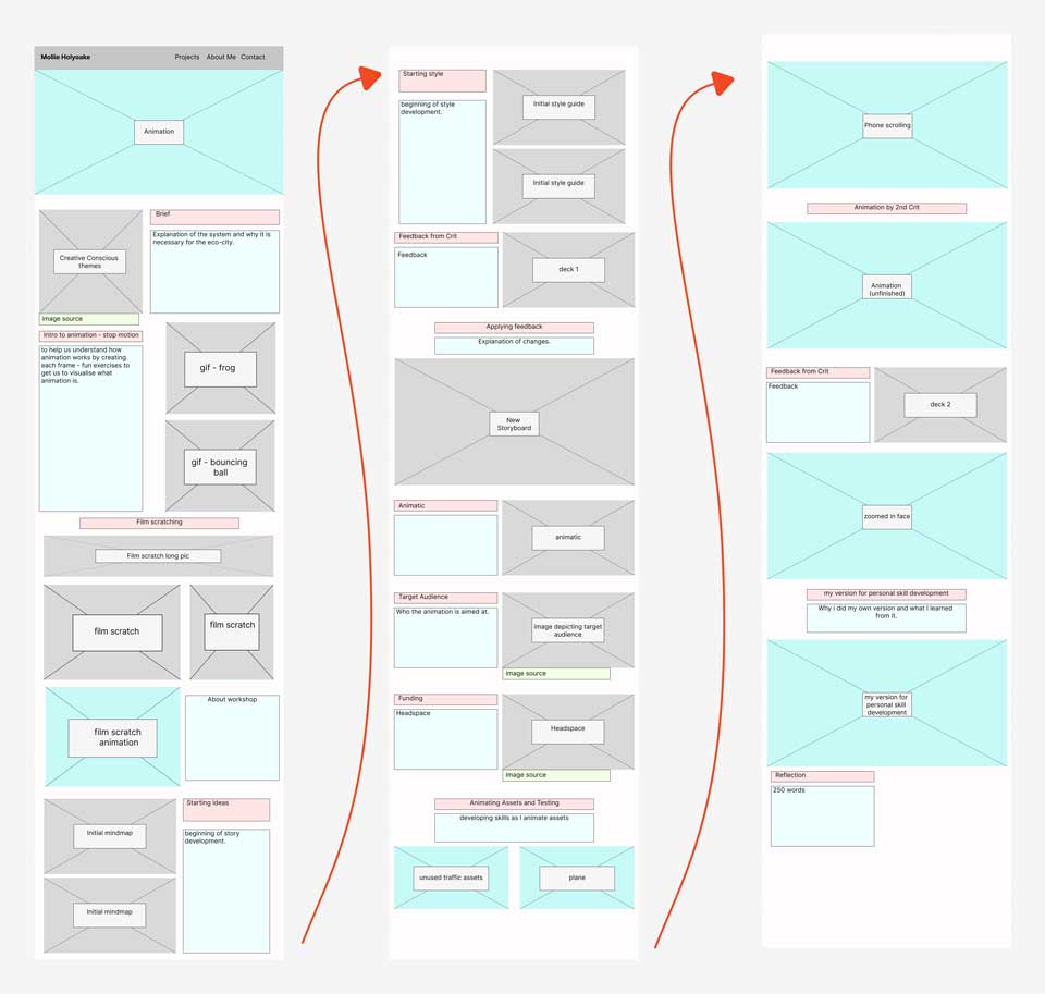
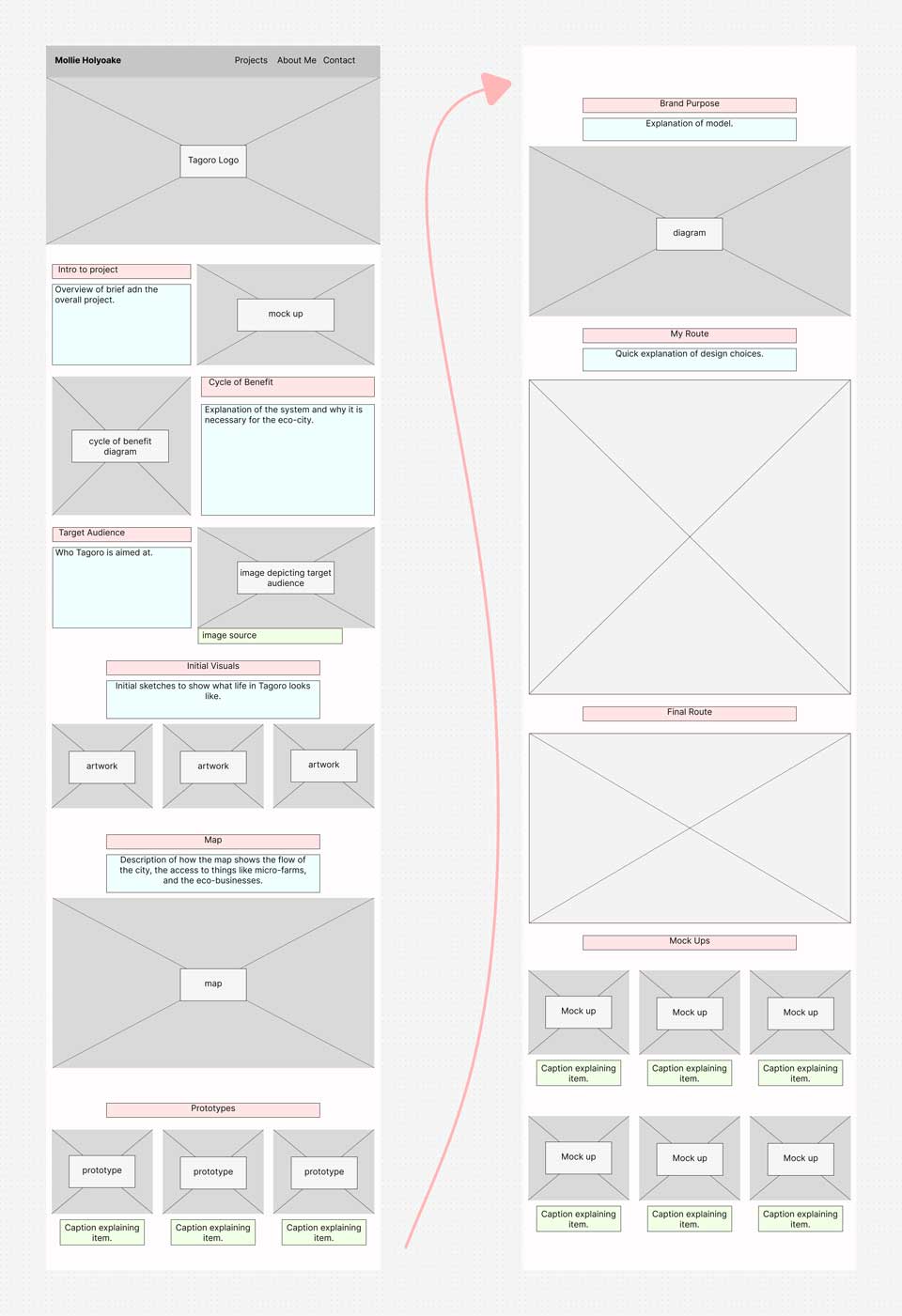
Structured Page Planning
Next, I made a clear plan of what I wanted each page to look like. I found this to be an important step for me, as through each project I have accumulated many images documenting my process and, therefore, it was key that I organised which ones I wanted to show in my portfolio.
I found these structured plans to be the most useful tool for this project, as it made the coding element flow much more smoothly since I already had a clear visual of where each element of the pages needed to go.
Colour Palette
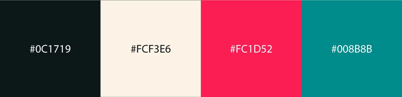
For my colour palette, I chose two base colours, to be used for the main text and background, and two accent colours, to be used for linking and subheadings. I didn’t want to use white, as I felt it was a little too bright, and so I instead went for a softer, warmer tone.
Testing Colour
I played around with how I wanted to use my base colours, as I was undecided as to whether I wanted a dark background with light text, or a light background with dark text. In the end, I chose to use the cream colour for my background, as the black felt a little too intense.
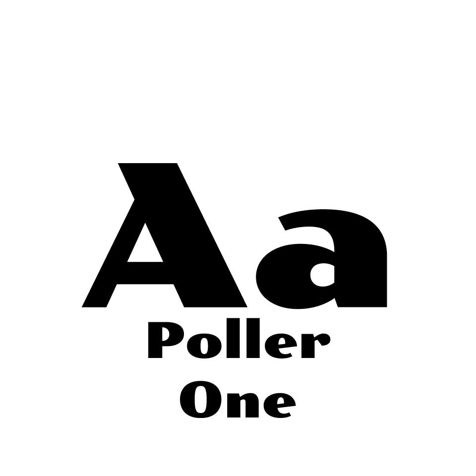
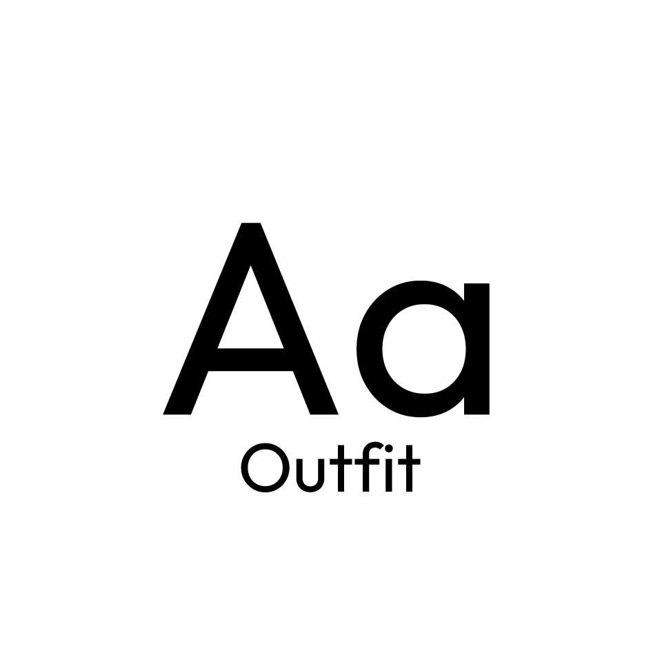
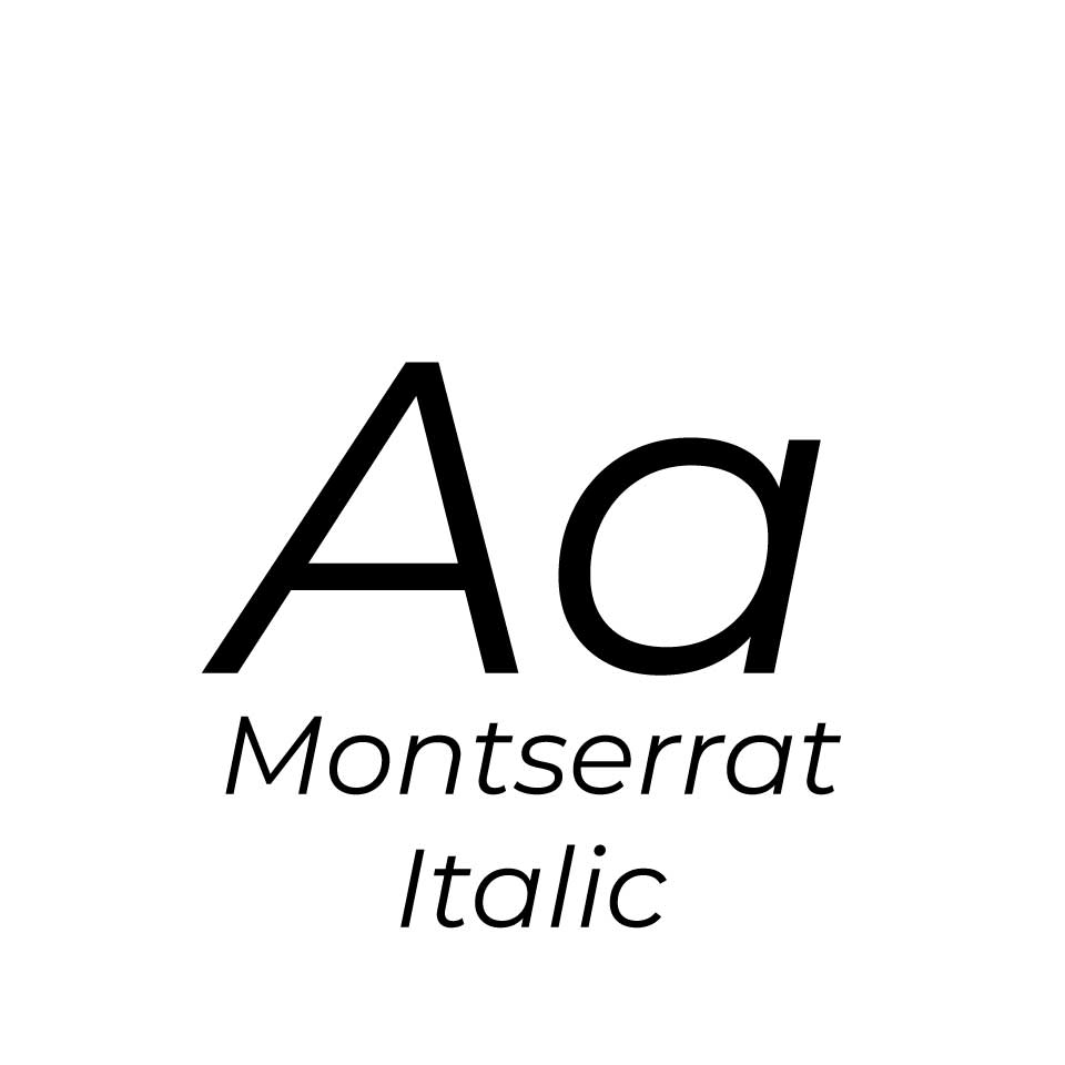
Fonts
I experimented with using four different fonts (shown on the right) for my website, however in the end I have only used three. Initially, I was using Poller One for my h2 and h3 text, but I found that while I liked the clear distinction between my headings and paragraphs, the thicker, serifed font looked a little clunky and distracting. I changed it for Outfit, which is still a little bolder than Montserrat (which I used for my paragraph text), and I think that the sans-serif font gives the pages a smoother flow.

Coding
CSS Grids
We used CSS grids for the layout of our pages. At first, I found this a difficult concept to grasp, but through building this site I have wrapped my head around the relationship between the HTML and CSS file and have been able to create some of my own layouts using this method.
Interactive Elements
Collapsible
When looking at the websites made by previous students, I noticed that large chunks of information, such as the bibliography, were hidden in a collapsible, giving users the choice as to whether they want to see the long list of references. This was something I wanted to incorporate into my site.
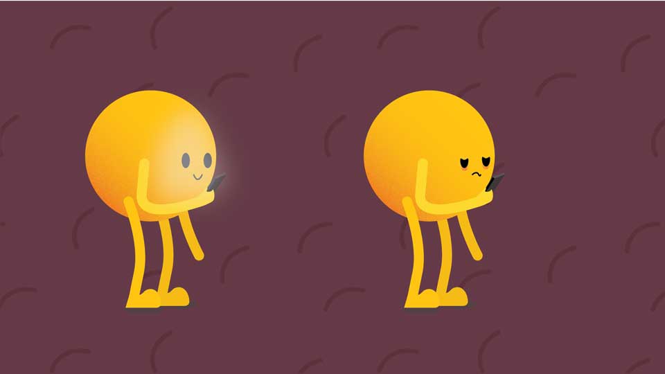
Image Hover
Another element I added was a hover effect over the linked images on my home page and in the ‘Other Work’ section at the bottom of my project pages. The effect adds a low opacity overlay and a slight zoom, which I think adds a lot to the visual experience as opposed to the image remaining static.
Image Slider
For sections where I have multiple images, I decided to use a slider to reduce the amount of space the section took up on the page. The slider has three navigation dots at the bottom, and I edited the colour to match the palette of my website.
Troubleshooting
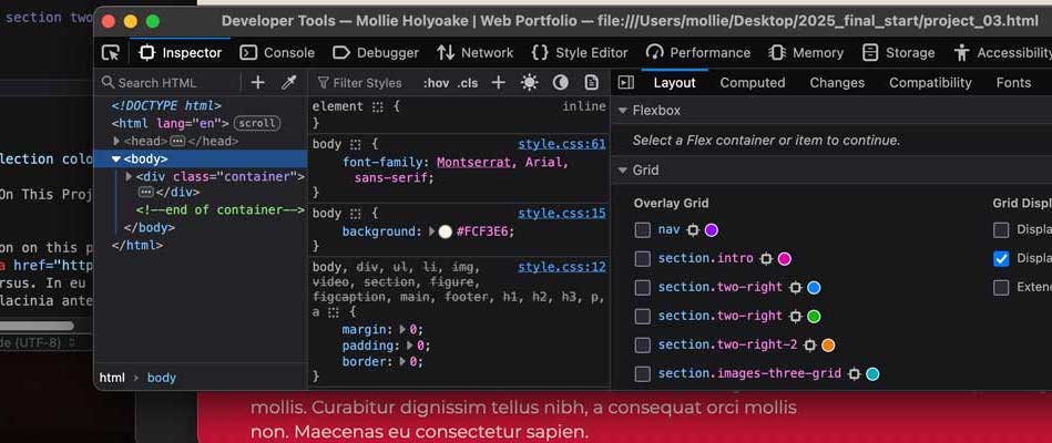
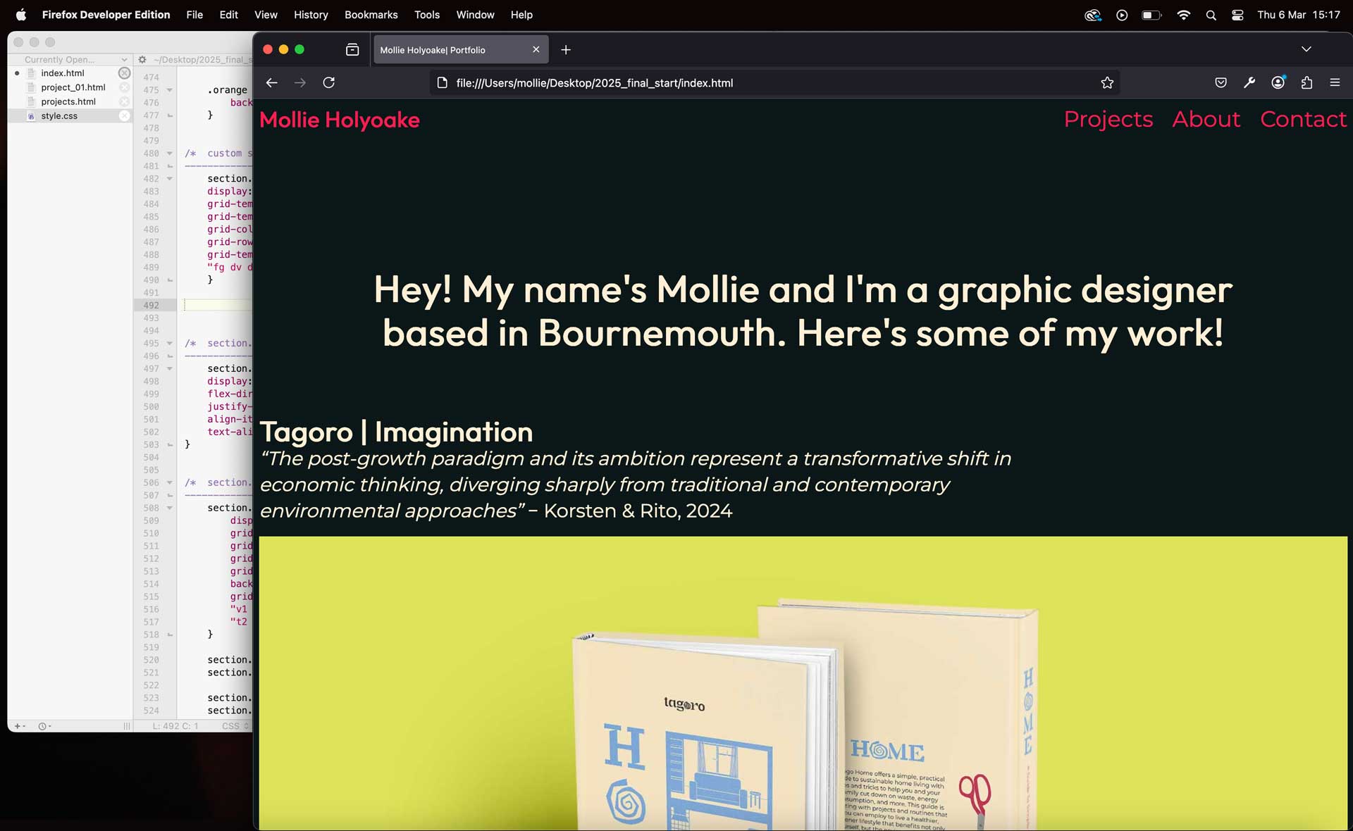
Firefox’s Developer Tools has been extremely helpful for identifying the different areas of the page, and it is what helped me really understand how the CSS styles each specific section. It has also been helpful for identifying specific areas of the page, so that if something has gone wrong I can more easily find where the issue lies.
Sustainability
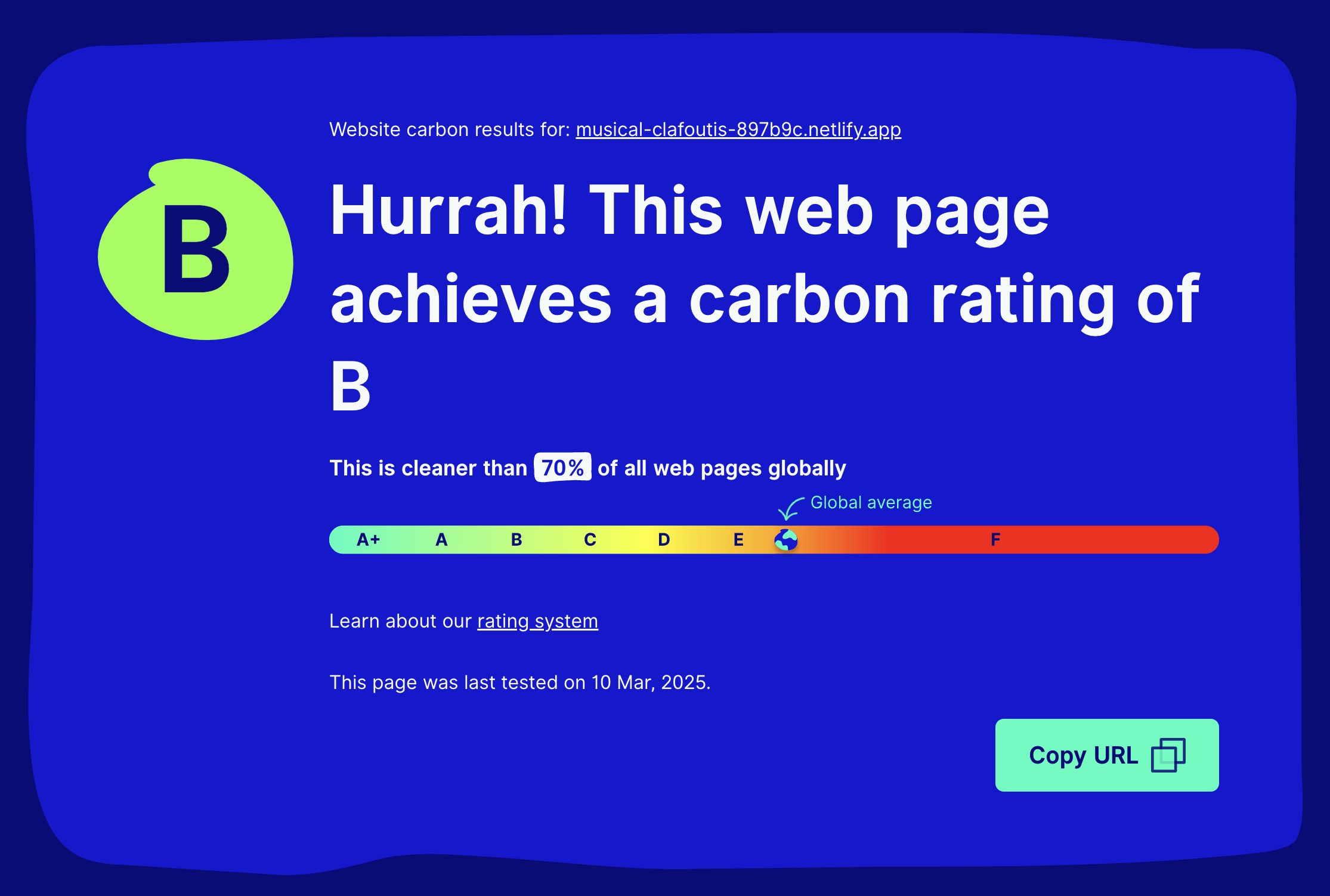
I also kept an eye on the environmental impact of my website using the Website Carbon Calculator. I made sure to go through all of my image and motion files to reduce their size as much as possible without impacting the quality.
User Testing
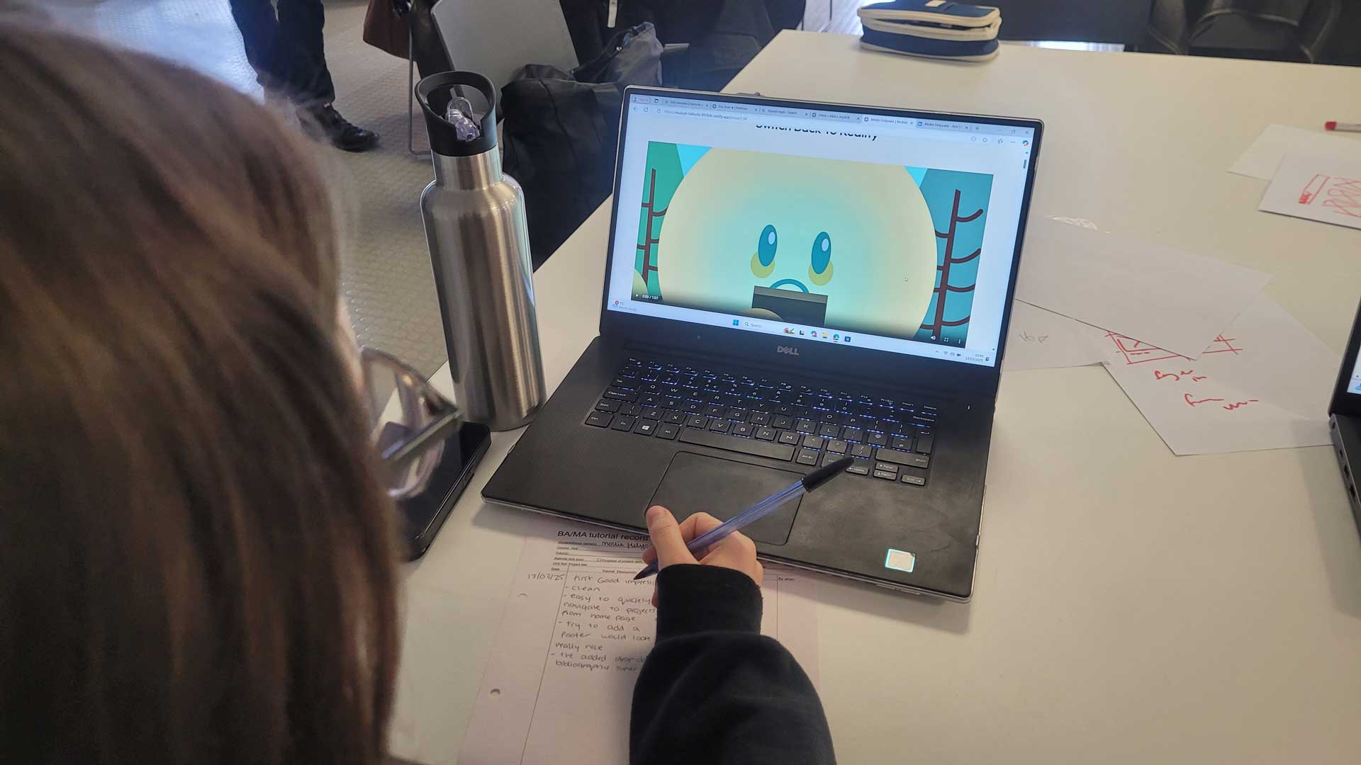
At the final stages of our project, we had users test our websites to ensure that the navigation worked and to offer any feedback on how we could improve before handing in our work for this unit. The feedback that I got was to include a 'back to top' button at the bottom of my pages to improve the website's navigation.
Reflection On This Project
During this project I have learned a lot about a subject that I had no previous experience with. It has been a great challenge, with many learning curves, and I am proud of what I have been able to produce.
In preparation for this project, I did the Free Code Camp’s Basic HTML and HTML 5 course, which was a good starting point for me as somebody who had no knowledge of how a page of code becomes a visually pleasing webpage. During this process I have not only learned the basics, but I have also pushed myself to learn more complicated interactive elements with the help of YouTube tutorials and the many useful resources provided to us by our tutor Mark Osborne, such as W3Schools CSS reference , W3Schools HTML Element Reference, and the Website Carbon Calculator which allows me to keep an eye on the environmental impact my site has. We were also provided with a template which has very much supported my construction of this website.
Looking through the code on the template and altering bits of code to see how the webpage was affected was another useful way for me to understand how the process worked.
However, putting all of this information into practice is what has really helped me get a grasp on basic HTML and CSS. Each mistake I’ve made and every error in my code guided my approach for the next stage of the process. Though it was a little daunting, challenging myself to figure out how to implement more responsive elements to my website and succeeding in doing so has also helped boost my confidence, and I think it has payed off as it gives the website a more polished and professional look.
This project pushed me far outside of my comfort zone, but with the support from our tutors, my peers, and the many resources available for beginners online I have been able to produce a functional web portfolio.
gridbyexample.com. (n.d.). Grid by Example - Usage examples of CSS Grid Layout. [online] Available at: https://gridbyexample.com/examples/[Accessed 5 Mar. 2025].
House, C. (2021). A Complete Guide to Grid. [online] CSS-Tricks. Available at: https://css-tricks.com/snippets/css/complete-guide-grid/[Accessed 5 Mar. 2025].
Sitnik, A. and Solovev, I. (n.d.). Easing Functions Cheat Sheet. [online] easings.net. Available at: https://easings.net/#easeInOutQuad[Accessed 7 Mar. 2025].
W3Schools (2019). HTML Reference. [online] W3schools.com. Available at: https://www.w3schools.com/tags/default.asp[Accessed 5 Mar. 2025].
Website Carbon Calculator. (2025). musical-clafoutis-897b9c.netlify.app - Website Carbon Calculator. [online] Available at: https://www.websitecarbon.com/website/musical-clafoutis-897b9c-netlify-app/ [Accessed 11 Mar. 2025].
www.freecodecamp.org. (n.d.). https://www.freecodecamp.org/learn<. [online] Available at: https://www.freecodecamp.org/learn [Accessed 2 Jan. 2025].
www.w3schools.com. (n.d.). CSS Colors. [online] Available at: https://www.w3schools.com/cssref/css_colors.php [Accessed 5 Mar. 2025].
www.w3schools.com. (n.d.). CSS Reference. [online] Available at: https://www.w3schools.com/cssref/index.php[Accessed 5 Mar. 2025].

