Switch Back To Reality
A collaborative motion graphic to highlight the effects of phone addiction.
Switch Back to Reality, a motion graphic made in collaboration with Hannah McGuire, Claudia Lawrence, and Tom Coventry.
Narrative, Sequence & Interaction | Motion
For this project, we worked in groups to produce a 1 minute animation. Sequences are used for many things, from product launches, campaigns, advertisements, and more. They are an effective way to engage people and draw attention to that which you are trying to promote, and so I was eager to begin working on this project.
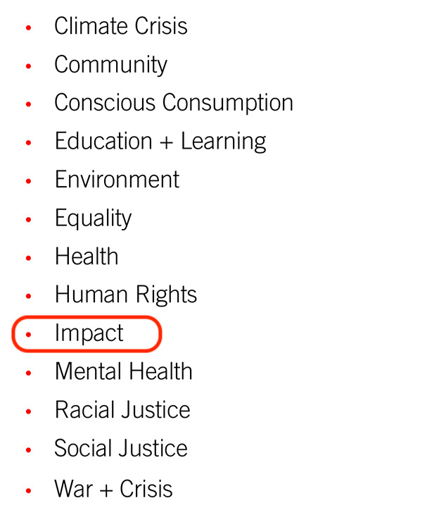
We had the option of submitting our work to the Creative Conscience Awards. My team and I all wanted to do this, and so we chose from the list of themes that Creative Conscience outlines for this year’s awards. After some consideration, we decided to choose ‘Impact’.
We produced an animation that is just over a minute long that explores the relationship we have with our phones.
Initial Ideation
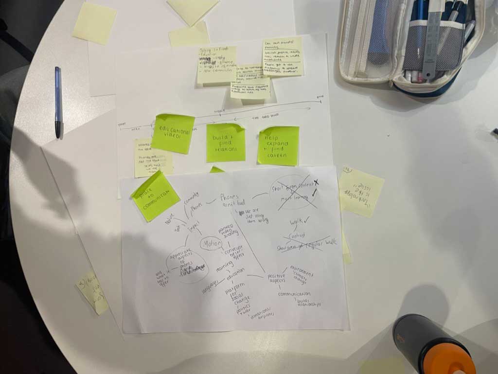
When me and my team began working on our sequence, we started by making a mindmap to outline all of our starting ideas. The theme of ‘impact’ can refer to so many different things, but we decided to focus on the impact of phones. Nearly everyone has one, including young teens and even some children, and so it felt like a pressing thing to explore.
To begin with, we thought about realigning the way we look at our phones. Yes, they can be harmful when things like social media take too much control over our lives, but they are powerful tools that, if used in a powerful way, can have a positive impact on our lives as opposed to a negative one. We noted down all the helpful things phones can do, like give us access to a world of information with just a few clicks, allows us to contact people from far away, assist in our education, and more.
I really liked this idea, however we quickly realised that the story we were trying to tell was a little too long to fit into a 1 minute animation without it feeling too rushed and thoughtless, and so we took a different approach. We decided to instead focus on promoting healthy boundaries with our devices, and to remind people that there’s a real world outside of their screens.
Initial Style Guides
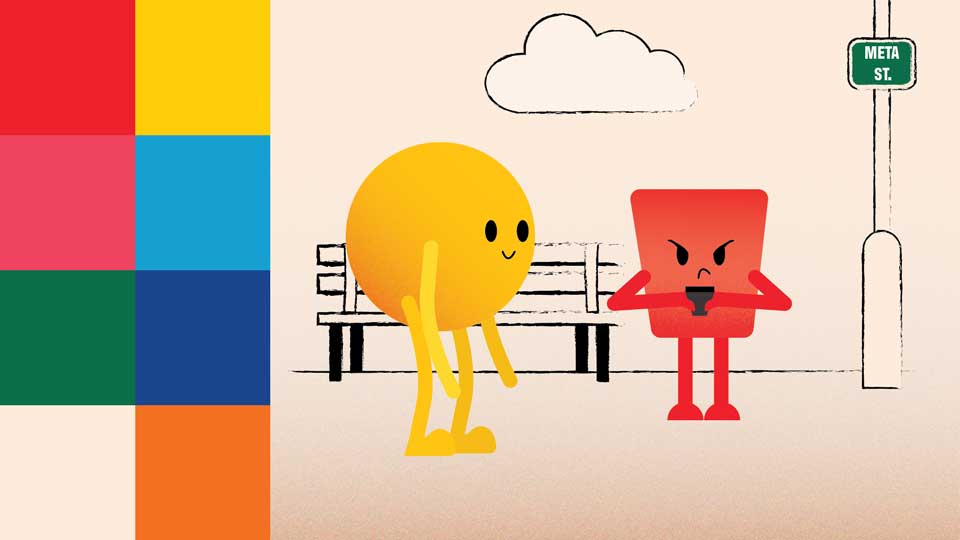
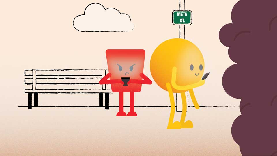
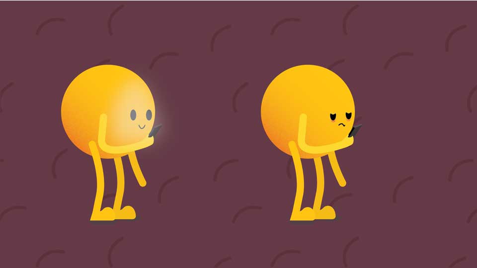
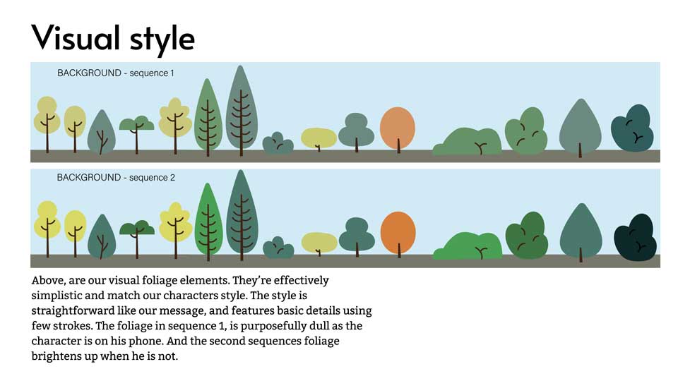
Shown on the right are the initial style guides I designed on Illustrator. We thought about adding texture with grain and using a soft warm colour for the background and bright colours for the character to create a nice contrast.
To begin with, we sketched the other characters as different shapes, partly as a way to represent how people are all different, with different personalities, feelings, and responses. However, we found that the issue with that is that when turned to the side, the shapes like the triangle look a lot like a rectangle. So, we decided following this that all the characters would be circular in different colours.
First Crit Feedback
For our first critical feedback, we not only got some great advice from our tutors but we also had the opportunity to present to Tim Varlow, an expert in moving image. From our tutors and peers, we were advised that we had good character design, especially without legs. The comedic aspect and fog/brain fog concept work well, but the story was confusing and the call to action needed clarity. We were also advised to consider a more personal way to present the fog and reinforce key messages when presenting. We needed to simplify the story, avoid unnecessary detail, and ensure engagement is clear from the start. We also needed to make the storyboard easier to understand and use language that resonates with the audience, and clarify the commissioner and potential company partnership.
Tim’s advice was to keep it simple and highlight isolation caused by phone use. He said that we should clarify some of the sarcasm, and that we could add background gags. We needed to clearly show what the character is missing, and we could use something like a butterfly flying past as a symbol of awareness. He also advised us to widen the lamppost shot for the punchline and to remove unnecessary dialogue and simplify the beginning. He said we could add a "Look up" sign as a gag.
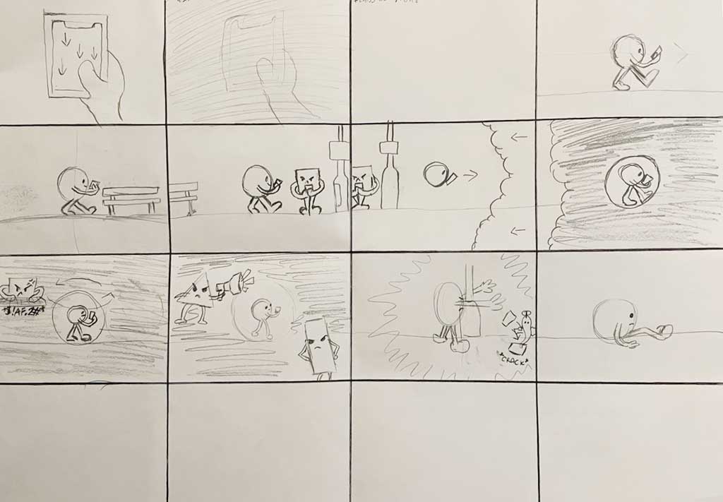
Reworked Storyboard
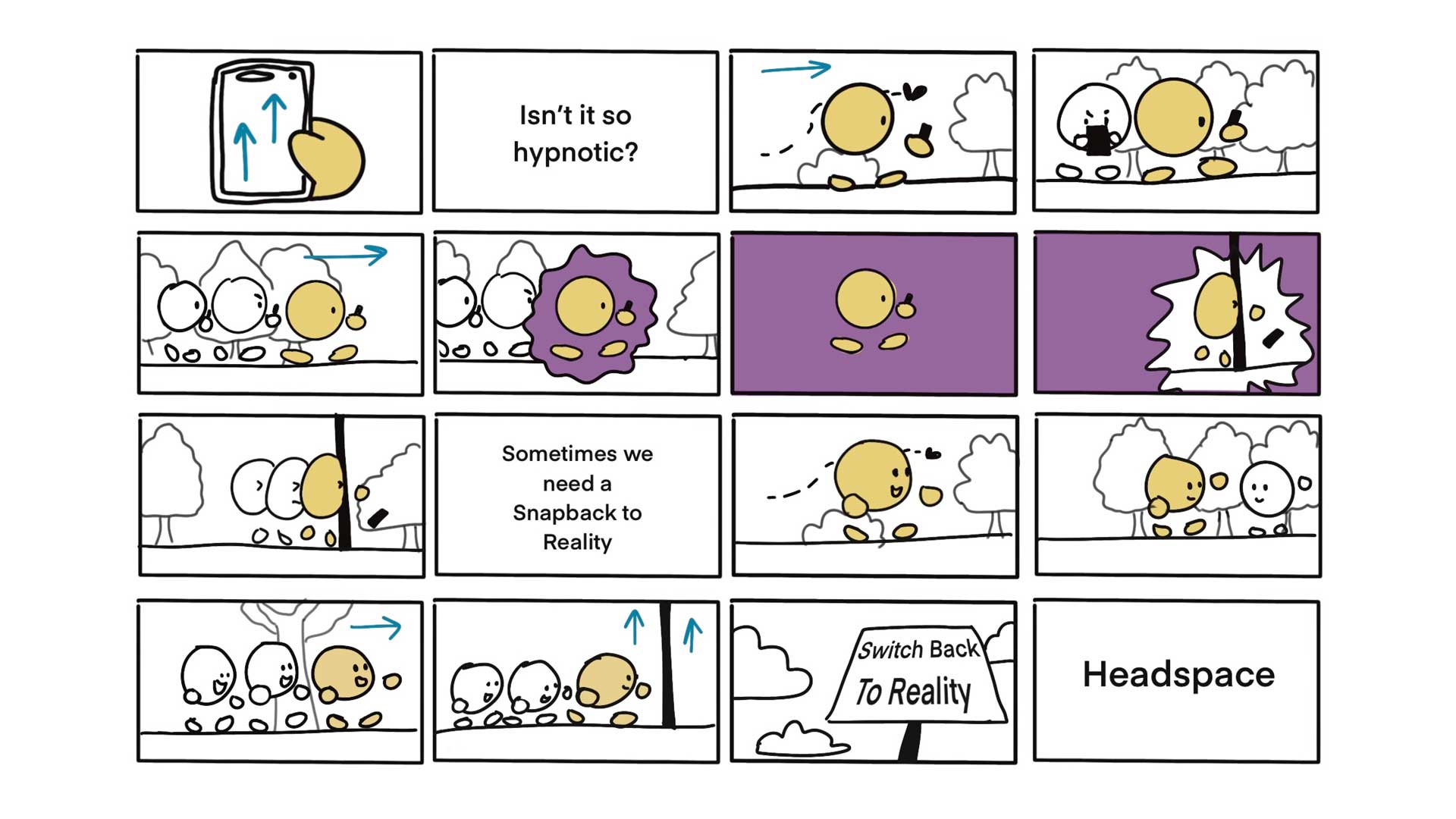
Animatic
Here is a short animatic I made using the reworked storyboard to test pacing. For the voice over I used AI as a temporary stand in as at the time we were working a lot on the script, which needed condensing, so that we could send it to the voice actor we wanted for the sequence.
Target Audience
Our target audience is 11-18-year-olds, a crucial age for developing cognitive function and being highly influenced by social media. We used a casual and engaging storytelling tone for the sequence while keeping the message impactful, hoping to draw the attention of younger people and teens. While phones are essential in today’s age, with our animation we aim to encourage mindfulness about how we use them.
Project Funding
We envision Headspace funding our animation, as they specialise in mental health awareness and offer resources like the article “Are you addicted to your phone?” Supporting a project on mindful phone use aligns with their mission, and we’ve reached out to them. Our video is intended to appear primarily as a YouTube ad, aligns well with our target demographic, with Gen Z making up 25.1% of its audience. Unlike other social media such as TikTok or Instagram, many adverts on YouTube cannot be skipped, and if they can they at least force a five second ‘break’ before you can get to the content that you’re after. However, the aspect ratio of the ad can be reworked to suit other platforms, especially those that have you almost mindlessly scrolling through them, as the ad may encourage those to stop swiping.
Scripting and Voice Over
One thing that sets this project apart from those that I have worked on previously is the need for a script. As a group we found it challenging to find a balance between the visual and audible story, and our script went through many heavy-handed cut-downs throughout the process of making this animation. For each crit, one of the biggest points of feedback we got was that our script was too long, and so we spent a long time figuring out which lines to remove without effecting the communication of the story. This was a lot more difficult than I had anticipated it would be, but in the end we managed to condense our script down. It was an even greater challenge as we were outsourcing the voice over from actor John Hannah, meaning that we needed to finish the script quickly in order to send it over to him.
Animating Assets and Testing
As we moved on to actually animating this project, I made a few different tests. As the work was being split between four people, and we each needed 15 seconds worth of animation each, we decided to divide the work up by assigning one person to put together the compilation, and the rest of us would animate the assets that give the rest of the animation more character. As After Effects isn’t one of my strongest skills, I started with just a very simple test using the sequence we had at that stage and inserting some test assets I made as practice, before I moved on to developing the phone swiping scene which opens the sequence as well as an aeroplane asset to go in the background.
Second Crit Feedback
The feedback we got from our second critical reflection was that the walk sequence is effective, and the fog/void fade-in snap-out transition works well. We were told to be mindful not to make the animation too busy, but the design looks purposeful. It was suggested to make a temporary voiceover — recorded by one of us — to help refine the script. The script communicates the message visually, but shortening some phrases would make it more impactful. Using fewer words with more meaningful sound, such as fading out world noises, would enhance the experience. The fog/void animation was strong, so we needed to ensure it remains a key visual element.
Following the feedback we received from our second presentation, I made a close-up shot of the main character walking. I think it adds a more personal aspect to the animation, and it also clarifies the issue as being the phone taking up all of his attention.
Final Crit
The feedback we got from our final critical reflection was to remove the feet from the start of the animation or switch the background to make it clearer that they are the feet. We were also advised to change the butterfly by removing the outline so that it fits with the rest of the design. Our tutors thought we needed more interactional noises in the sound design, and some sound that ties the animation more with Headspace like meditative music in the background.
Test Voice Over With John Hannah
Here is a test I made of the animation with the voice over that was very kindly provided to us by John Hannah. I wanted a general idea of what the pacing and tone would be like before we develop the animation’s audio further, and I think his calm, comforting, though at times confronting tone works perfectly for the story we are trying to tell.
Personal Development
Alongside the animation that we worked on as a group, I also decided to remake the sequence to the best of my abilities to develop my skills in the areas of the group animation that I didn’t contribute to, such as the walking cycle. It was also an opportunity to experiment with applying my own style to motion graphics and to play around with how else our vision could be presented. I didn’t include all of the elements that are in the original group project, but I found this very beneficial to developing my abilities in After Effects. Keeping the various elements in time with one another is something I still need to work on, however working on an animation where I already had a reference point has helped me strengthen my skills.
Intro to Animation Workshops: Stop Motion
As many of us did not have a lot of experience working with motion, our tutor, Alice Stevens, took it back to the very basics so that we all had a clearer understanding of what sequences are: lots of pictures flashing by so quickly that it creates the illusion of movement.
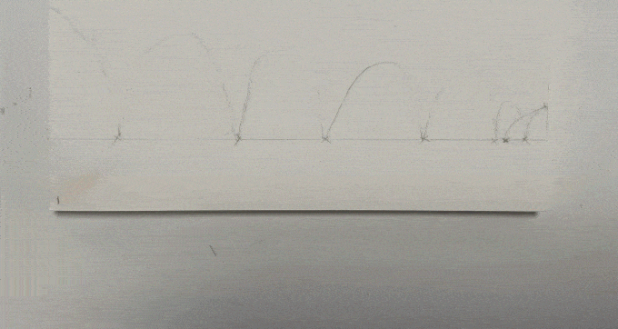
During one of our first workshops, we made some short stop motion clips, creating the frames by hand and then photographing them to turn into to a sequence. I found this workshop fun and insightful, and while digital tools such as After Effects made the process of animating much quicker, it was helpful to see the bare bones of what animation is at its core — one still image, then another, and another.
Flick Book
I enjoyed our tutor Alice's workshop on stop motion so much (as well as her passion for flick books) that I decided to make one of my own. I made this little book by first creating the animation in ProCreate and exporting the layers as PDFs, which I then printed, cut out, and bound.
Take a look at the book being used!
Click here to see the original animation.
Film Scratching

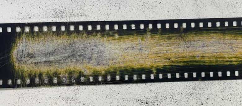
Another interesting workshop was held by our tutor Mark Osborne. In this class, we took traditional film and used blades and sandpaper to scratch patterns into it. Again, this was another physical visual for what motion is.
Next Steps: Creative Conscience
The next step for this project will be refining it in preparation for our submission to Creative Conscience. We will be working more on the audio, as well as minor fixes in the animation.
Critical Reflection
I found this project to be fast paced but exciting, and it has sparked an interest in me to develop my skills in After Effects and delve further into the world of motion graphics.
After Effects is not one of my strongest areas when it comes to software, and so this project was an opportunity to improve my skills in the program. The sequence also challenged us to not only consider the visuals, but the sound too. We needed to think about the sound effects we might use, and whether or not the sequence would have a voice over.
One of the biggest challenges that I personally found was actually in the planning. With my limited understanding of the program we were working with, I constantly found myself struggling to come up with ideas when I wasn’t sure how to put them into practice. Of course, this changed the further we got into the development, and I got hands on with the animation, making this project a huge learning opportunity for me.
It was intimidating initially, since After Effects is such a big program with countless features, but I utilised the support from the tutors and the technician, Ben Marriot, who taught and assisted us in our workshops, as well as the limitless online resources available to find my way around the software and to learn how to bring my own and my team's ideas to fruition.
Despite how short this project was, I feel that I have gained so much from it. Motion always intimidated me before, as designing a static piece is one thing, but to consider how to give movement to your work opens up an entirely new set of challenges and adds an additional layer of difficulty. I am eager to continue practising After Effects in my own time so that I am more proficient in it for future projects, as motion offers so much potential to our graphic designs.